My first impressions of macOS Big Sur
Categories
I quickly upgraded to the newly released Mac operating System macOS Big Sur and liked my experience in the first few days. I think it’s great that we get a refreshing look all over.

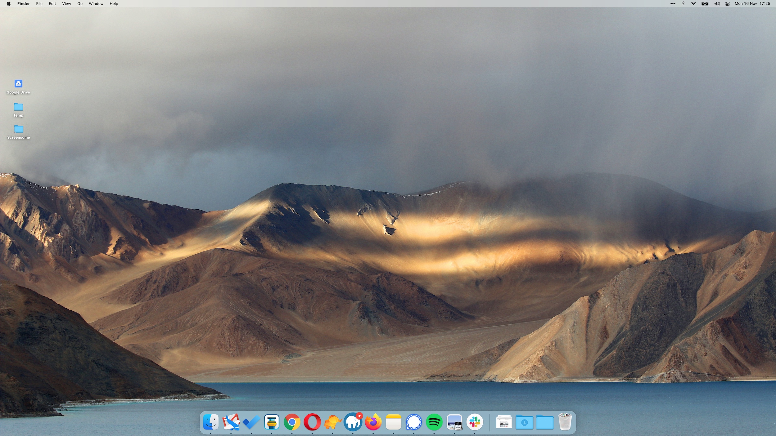
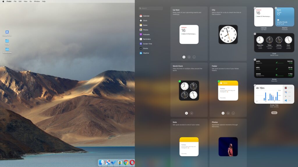
The plain desktop on macOS Big Sur Adding / editing widgets 
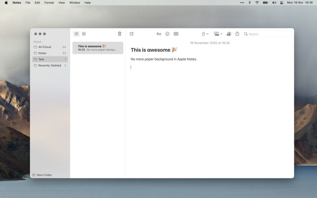
Apple Notes now has a plain white background 
Finder has a clean new look 
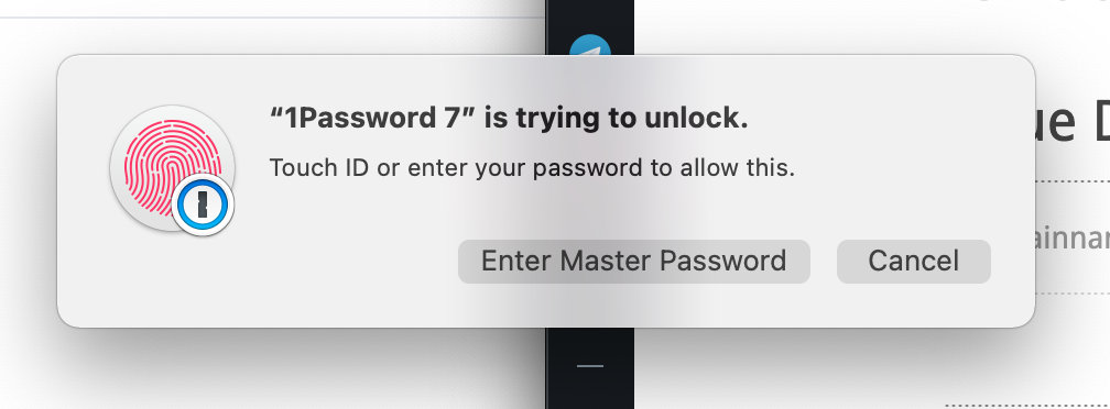
How a typical alert box looks like 
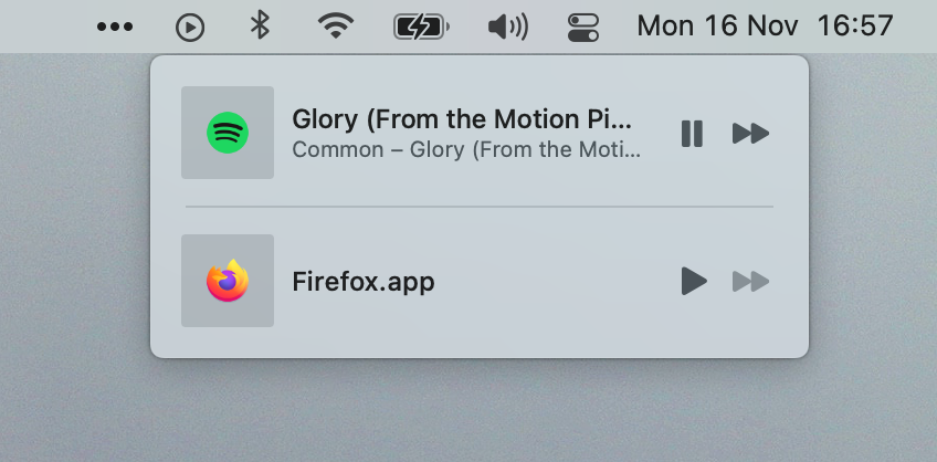
Audio controls 
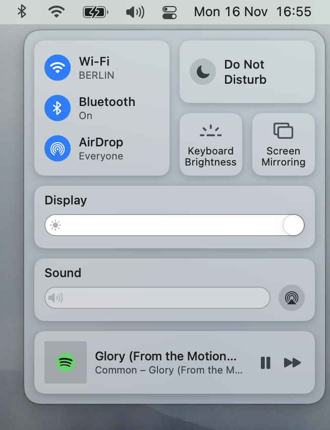
Thr new Control Center 
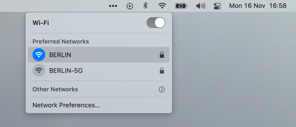
Wifi controls 
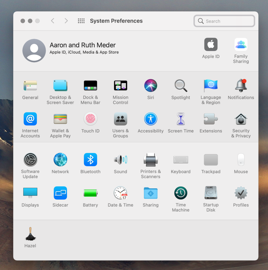
System preferences with new icons. Don’t like all of them (Network for example) 
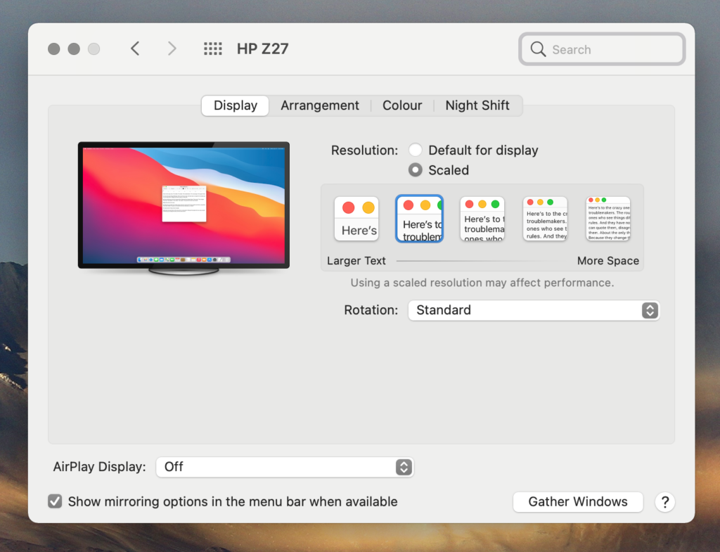
Displays system preferences 
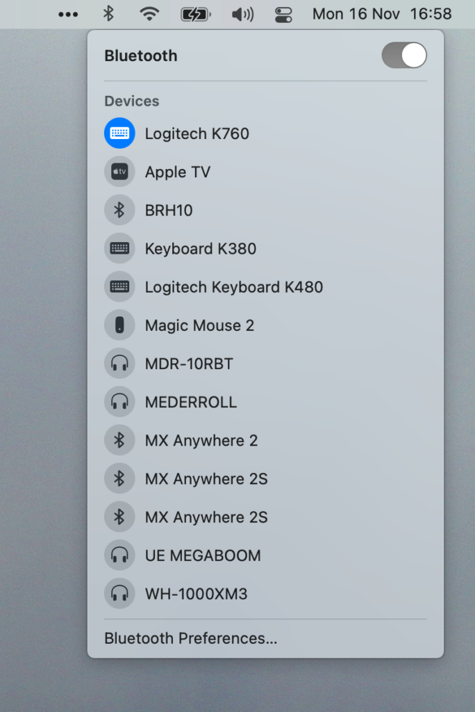
Bluetooth controls 
Notifications on top with the new widgets


Overall it looks like the updates take some inspiration in mobile UI design with a bit more spacious, rounded elements. Still they feel very good to use with the mouse.
While the installation stalled for around two hours at the 100% progress bar it luckily still finished afterwards. I did not experience any technical or compatbility issues with the OS or third-party apps at all so far otherwise.
Update
The Verge just published their review of macOS Big Sur. It provides more insight into the update and also the changes that landed in Safari 14.